THE NATURAL
BOTTLE
BRAND BOOK
The visual system for a bio-engineered material platform. Logo, color, type, and the key visual assets that carry the principle of nothing left behind — from forest floor to molecular architecture.
THE MARK
A constructed mark: a square boundary enclosing a single filled circle. The square is the vessel. The circle is the material — complete, returned, nothing left behind. The geometry is deliberately reductive. It scales without loss.
CONSTRUCTION & CLEAR SPACE
Minimum clear space equals the radius of the inner circle on all sides. The mark never sits closer than this to an edge, another element, or a photograph.
MINIMUM SIZE
SIX TONES,
ONE FOREST.
Canopy surface with Patina accent. The default for all digital surfaces.
Linen or First Light surface with Canopy text. Reserved for technical documents.
No pure black, no pure white. No neon. The palette is earth and metal.
TWO VOICES
A monospaced technical voice for data, codes, and labels. A bold sans for headlines and narrative. The mono carries the laboratory. The sans carries the conviction.
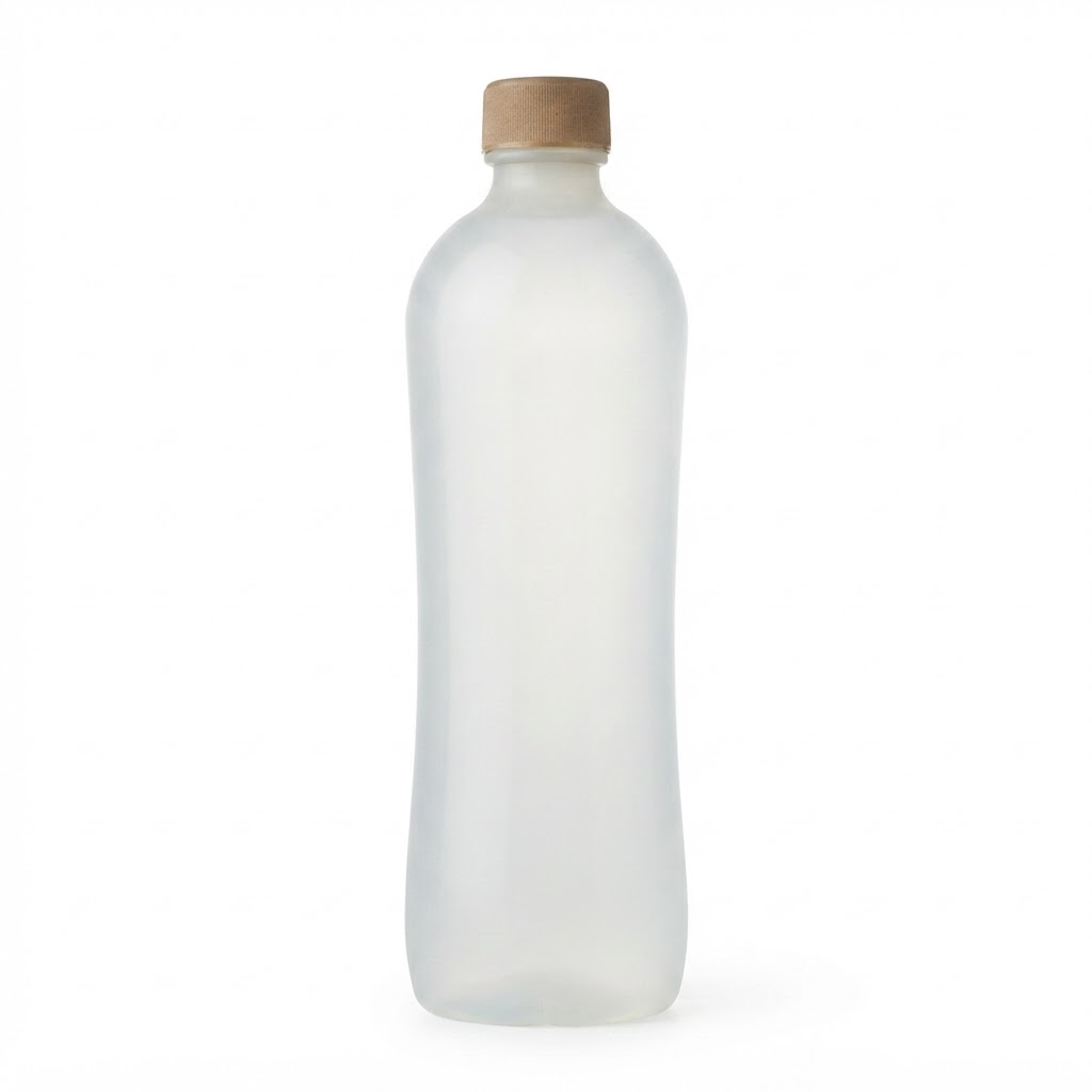
We built a bottle that returns to the earth it came from. No fossil fuels. No microplastics. No compromise.
SCALE
THE MATERIAL,
MADE VISIBLE.
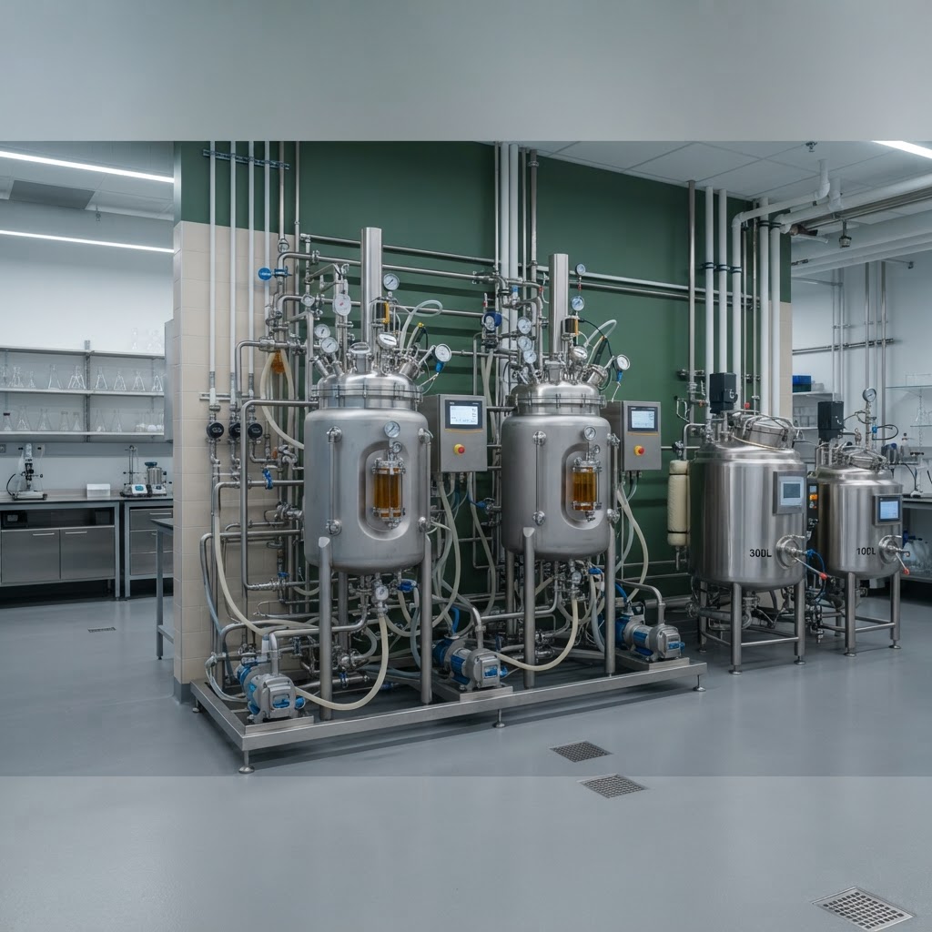
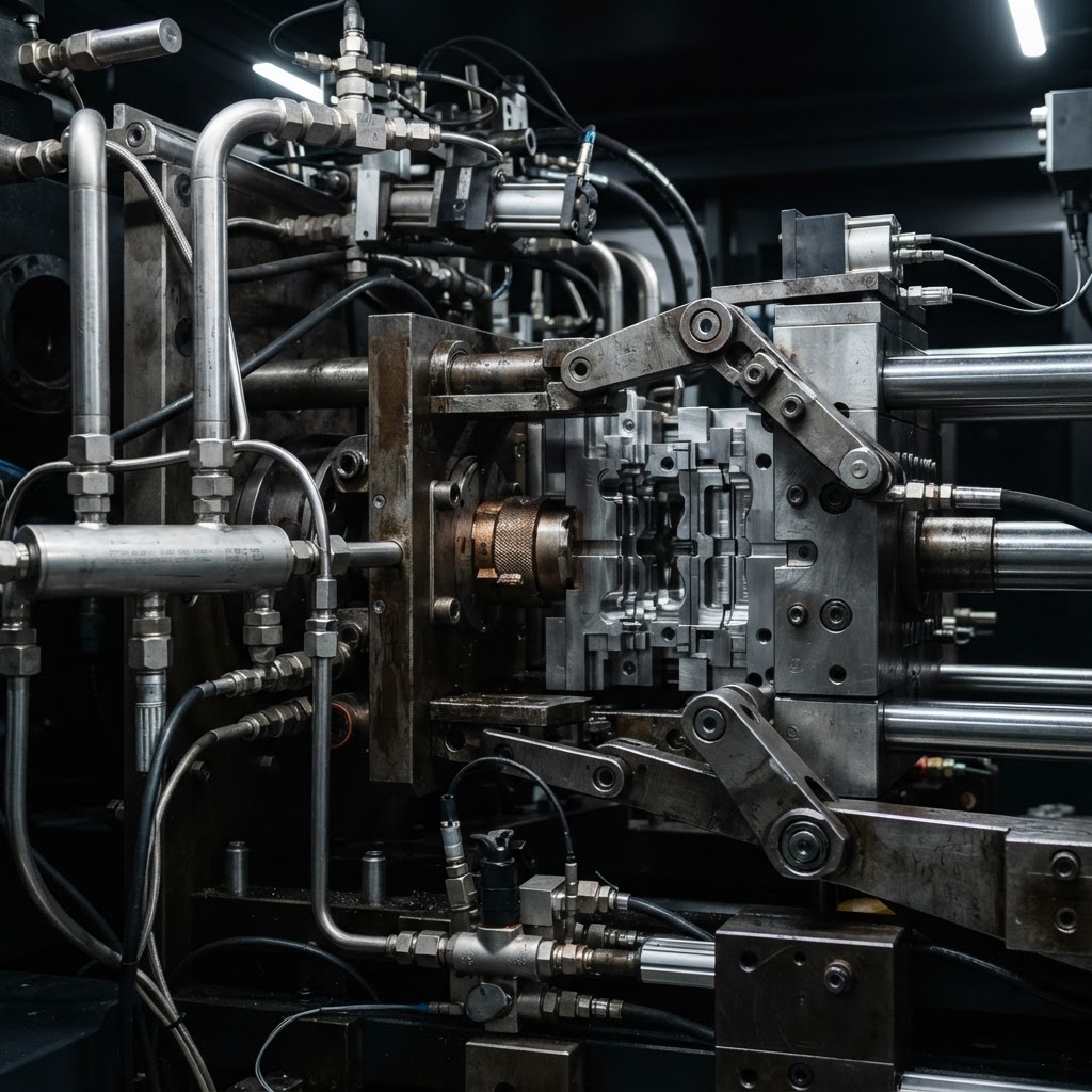
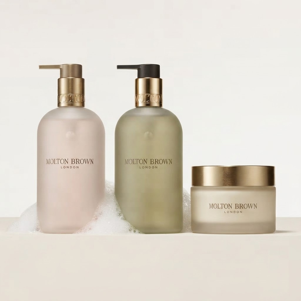
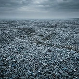
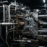
Three asset families carry the brand visually: the forest scenes where the bottle returns, the molecular architecture that defines it, and the three product pillars that deploy it.
04.1 · FOREST BOTTLE SCENES






04.2 · MOLECULAR ARCHITECTURE


04.3 · THE THREE PILLARS




04.4 · SUPPORTING ASSETS









04.5 · BRAND FILM
MATERIAL TRUTH
Every image answers to the same standard as the material: nothing left behind. No gloss, no greenwash, no aspirational stock. The bottle is photographed where it belongs — in soil, on moss, in the hand — at the moment of its return.